
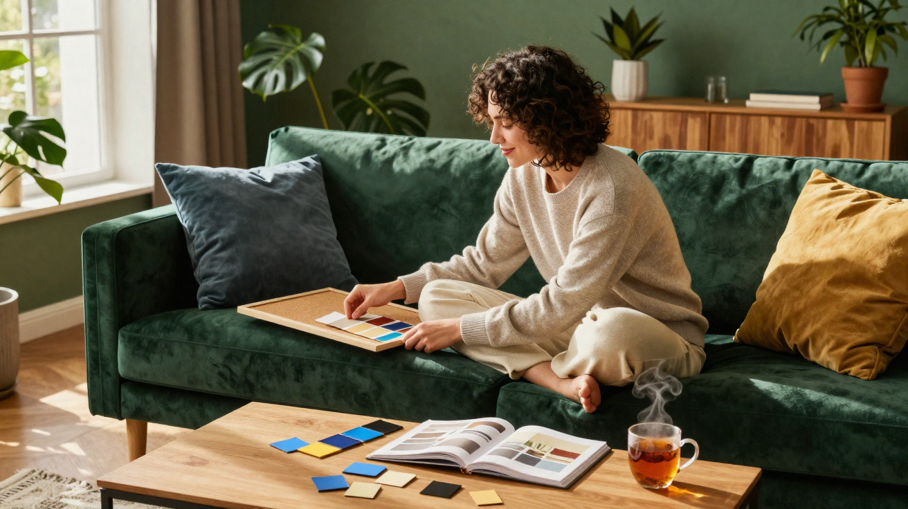
On a Sunday afternoon at friends’ house, it is rarely the size of the television or the sofa brand that strikes you first. What lingers, almost without notice, is the feeling created by the room: a deep green living room that soothes, yellow walls that energise, beige that reassures, or blue that creates a little distance. We all know that moment of stepping into a place and immediately feeling at ease… or slightly scrutinised. Colour works before words do, in those first few seconds. It does not define a person, far from it, but it can reveal a mood, an aspiration or a way of welcoming others. And green, often chosen for its understated elegance, is certainly not a meaningless choice. Your living room is already saying something.
Living room colour: a more personal choice than it seems
In an off-white living room, everything appears to breathe: objects have room around them, light travels freely, and guests may relax without quite knowing why. This option is often favoured by people seeking brightness, visual order or a kind of sanctuary after overly busy days. White does not necessarily point to a cold temperament; it may simply express a very practical need for calm and simplicity.
By contrast, brick red, terracotta and burgundy make an instant statement. A frequently cited study into colour perception, carried out in consumer and environmental settings, suggests that warm shades heighten feelings of closeness and energy, while cool shades encourage a sense of distance. For Léa, 38, a terracotta wall turned a living room that was once “clean but sad” into a space where dinners last longer.
Colour psychology cannot produce a clinical portrait from a tin of paint, and that would be far too simplistic. Instead, it considers cultural, emotional and personal associations: yellow suggests momentum, blue stability, while darker shades can evoke intensity or the need for a cosy retreat. The particular shade matters just as much as the colour itself, because sage green does not tell the same story as emerald green.
Green in the living room: soothing, grounding and sometimes making a statement
Green has become a reliable choice for contemporary living rooms, yet it should not be dismissed as merely an Instagram trend. Naturally associated with the outdoors, it can reflect a need to slow down, bring a sense of life into a highly urban routine or create a protective atmosphere. Soft, muted sage green often appeals to people who want a gentle interior without covering every surface in beige.
Forest green and bottle green convey something different: a more assertive character, a preference for enveloping surroundings and, sometimes, a wish to entertain in a setting with real personality. A common mistake is assuming that a dark wall will inevitably make a room feel smaller. Let us be honest: nobody actually measures their living room every day; what matters is the balance of light, curtains, materials and how you feel when sitting on the sofa.
A successful colour is not one that looks impressive on a screen, but one that remains pleasant after a long day. To choose a shade you will not tire of, look at your living room at different times, in the grey morning light as well as in the evening.
“Colour is a silent language: it can welcome, stimulate or provide shelter, depending on how it is staged.”
- Sage green suits people looking for softness and visual breathing space.
- Olive green warms a room and pairs easily with wood, linen and leather.
- Emerald green creates a more theatrical effect, ideal for a single wall or a bright living room.
Blue, yellow, beige or black: what your décor may suggest
A blue living room often points to a desire for serenity, confidence or consistency. Greyed blues, common in family interiors, create the impression of a stable, lived-in home that feels almost reassuring. Yellow, on the other hand, tends to appeal to people who enjoy energy, lively conversation and unexpected details; used in small touches, it can make a room cheerful without making it shout.
Beige and sandy tones are sometimes considered overly restrained, although they often reveal a genuine sensitivity to materials and light. They work well for anyone who wants to change cushions, prints or flowers without redecorating the entire living room. Black, finally, does not mean that someone lives in melancholy: it can show an unapologetic taste for contrast, elegance and interiors with a strong backbone.
Before repainting, test a small area near the window and observe it for three days. A colour may look splendid at midday, then seem dull at 7 pm under a cool light bulb. Your physical response is a useful guide: if you breathe out a little as you enter the room and your shoulders drop, the shade has probably found its place.
A room that reflects you, rather than a décor you have to prove
Ultimately, your living room colour does not reveal a fixed truth about your personality; above all, it shows what you need right now. A turbulent period may make you want a soft green, a new chapter in life may call for yellow, and moving house may draw you towards pale walls, like an almost blank page. Our interiors evolve because we do too.
There is something deeply personal about choosing paint: you do not view it like an image on a phone, you live with it through rushed mornings, impromptu meals and evenings when you do not want to see anyone. The most appealing living room is not necessarily the one that ticks every trend. It is the one where you can leave a throw lying around without feeling that you have ruined the décor.
Perhaps that green you are hesitating to paint on the far wall is not a decorative folly, but a discreet way of asking for calm and a little depth. Or perhaps one colourful cushion is enough to begin. Colours have this rare quality: they can change a room’s atmosphere without requiring you to change your life, even if, on some days, the thought is tempting.
| Key point | Detail | Added value for the reader |
|---|---|---|
| Green is not neutral | From sage to forest green, it evokes nature, calm or a more assertive presence. | Choose a shade that matches the atmosphere you genuinely want. |
| Warm tones create connection | Terracotta, ochre and burgundy often make a space feel livelier and more enveloping. | Add depth to a living room that feels cold or impersonal. |
| The right colour is something you feel | Light, materials and your everyday reaction matter more than a trend. | Avoid a choice that looks attractive in photos but becomes tiring in real life. |






Comments
No comments yet. Be the first to comment!
Leave a Comment